In this article, we will take a look at some of the most important logo statistics that will help you create a design that perfectly embodies your brand and resonates with your customers.
The Most Important Logo Stats and Facts
- 75% of consumers recognize brands by their logos.
- 59% of shoppers would buy new products from a recognizable brand.
- 50% of consumers are more likely to patronize a brand with a logo they recognize.
- It takes about 5 to 7 interactions for consumers to recognize a brand logo.
- The human brain processes images 60,000x faster than words.
- 78% of consumers see logos as works of art.
- 60% of consumers would steer clear of brands that have unappealing logos.
- 42% of consumers think that a logo can effectively communicate a brand’s personality.
- 50% of small businesses design their own logo.
- 65% of small business owners are willing to pay $500 for a new logo.
- 40% of Fortune 500 companies use blue in their logos.
Why Are Logos Important?
Many new companies tend to focus on business plans and profitability, neglecting one of the most crucial parts of building a brand—having an effective and recognizable logo.
Actually, 28% of consumers say they would make logo design the number one priority if they were starting their own company. (source: Study Finds)
Why are logos so important?
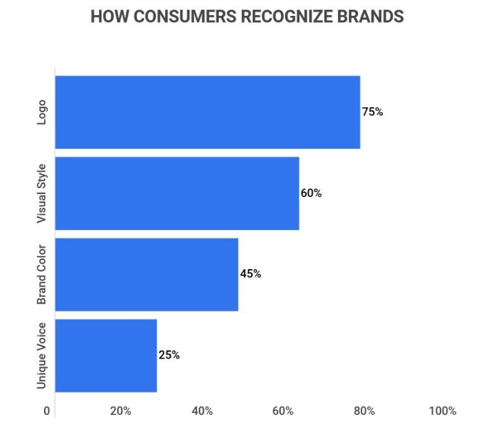
1. 75% of consumers recognize a brand by its logo.
Logos are the most recognizable brand identifier, well ahead of visual style (60%), color (45%), and brand voice (25%). (source: Zippia)
Here are some more reasons why it’s vital that you have a well-designed logo.
2. First impressions about a company are formed in just 90 seconds.
Even though it takes about five to seven interactions before people remember a brand, first impressions of a product or service are actually formed in 90 seconds.
It takes about 400 milliseconds for your brain to process a logo, while opinions about a website are formed in just 50 milliseconds.
What’s more:
- As many as 75% of respondents agree that the ‘look and feel of a logo can determine the brand’s chance of success.
- 50% of people are more likely to use the services or products of a company whose logo they recognize immediately.
- 60% of consumers would avoid companies with strange-looking logos, even if they had great reviews.
- Over a third think that a well-designed logo is a sign of a high-quality business.
- 78% of consumers believe that logos are works of art. (source: Study Finds, Finances Online, CXL, ZillionDesigns)
3. 59% of shoppers would rather buy new products from a brand they are already familiar with.
Also, 85% of consumers said that they would stay loyal to a company whose logo and brand they like.
Loyal customers are worth ten times more than their first purchase, further highlighting the importance of proper branding, and by extension the incorporation of a well-designed and effective logo. No wonder 89% of marketers see brand awareness as their primary business objective. (source: Finances Online)
How Recognizable are Logos?
4. 30% of Americans say the logo is the first thing they notice about a company, after the name and color.
Also:
- 36% of respondents in a 2020 survey say that a logo helps them remember the brand instead of the other way round.
- 42% think that a logo can tell them about the ‘personality’ of a business.
- The McDonald’s logo is recognized by 4-year-olds.
- When 156 Americans aged between 20 and 70 were asked to draw 10 famous logos from memory, 1,500 drawings were produced in just 80 hours. (source: Study Finds, ZillionDesigns)
5. Apple is the most recognizable logo in America.
Judging by a recent survey, the logo of the tech giant is the most recognized in the US.
Here are the top ten most recognizable logos in America:
1. Apple
2. McDonald’s
3. Coca-Cola
4. Nike
5. Starbucks
6. Google
7. Facebook
8. Adidas
9. Amazon
10. YouTube
Globally, though, Coca-Cola is still the most recognizable logo, identified by 94% of people across the world. (source: Study Finds, Strategic Factory)
How Much Do Logos Cost?
6. The starting price for a good-quality logo is $199.
Even though the starting price of a quality professional logo is $199, a very good logo design can range between $25,000 and $100,000. The least you can expect to pay is $5, but the quality is not guaranteed. (source: ZillionDesigns)
This bill might be too high for small businesses, though.
7. 65% of small business owners stated that they would pay up to $500 for a new custom-designed logo.
According to recent findings, 20% said they would go as high as $1,000 and only 15% would dish out more than that.
Luckily, there are cheaper ways to get a good-quality logo. (source: 99Designs)
8. Over 50% of small business owners design the logo themselves or work with an in-house team.
Thanks to easy-to-use and free software like Adobe, Sketch, Inkscape, and GIMP, even amateurs can craft professional-looking logotypes.
There are also plenty of graphic design platforms out there as well, some of which use AI to generate a custom-made logo based on the user’s input. This option is becoming increasingly popular as Australian design platform Canva boasts 200,000+ business users on its logo maker program, while Looka claims to have 3,241,627 business users (these numbers are self-advertised, but they still paint a clear picture of the popularity of these platforms)
It takes just 5 to 15 minutes to create a logo in a free logo maker as the process is done in four simple steps. In general, however, it takes about 2 to 5 hours to design an initial version of a logo as 20 to 30 sketches are created for one just logo design. (source: ZillionDesigns, 99Designs, Website Planet)
9. 21% of small business owners use the services of freelancers.
Another 18% carry out crowdsourced design contests, which means that only 7% of small businesses work with design agencies.
Sites like Upwork and Fiverr now provide more chances than ever to get a quality design at a low cost. There are more than 300,000 freelance logo designers available on Upwork, as well as more than 118,000 on Freelancer.com and over 134,000 on Fiverr.
In 2020, 400,000 businesses in the US worked with graphic designers, bringing the value of the graphic design market to $12.7 billion the following year. The estimated worth of the market for logo design services specifically was $3 billion.
Keep in mind that:
The cost to submit a basic logo trademark application is $325 and takes up to ten months to get it trademarked. The trademark only lasts ten years. (source: 99Designs, Website Planet, ZillionDesigns)
10. The logo of Symantec Brand & Acquisition, costing $1,280,000,000, is the most expensive logo of all time.
Many of the most effective logos, though, were made almost for free.
For instance:
- Nike bought their swoosh logo from a graphic design student in 1971 for just $35.
- The old logo of social media giant Twitter cost only $15.
- Google’s co-founder Sergey Brin designed the company logo back in 1998 using the free graphics app GIMP.
- The Coca-Cola logo also did not cost anything. This iconic logo was created in 1886 by Frank Robinson, the company’s bookkeeper.
Other companies, however, are willing to pay big money to get the right logo design.
- The BBC paid $1,800,000 for their logo
- The Arnell Group charged Pepsi $1 million for redesigning their logo.
- The Australia & New Zealand Banking Group paid $15,000,000 for the new logo and rebranding procedure.
Accenture paid $100 million for their new design. (source: Finances Online, The Logo Creative, Brand Crowd, Creative Market)
What Makes a Good Logo?
How to design the best logo for your business? Here are a few tips and tricks to help you along the way.
1. A colored logo design increases brand recognition by up to 80%.
Color is one of the most important factors to consider.
People need 90 seconds to form an impression of a product, and 60 to 90 percent of that impression is based on color alone.
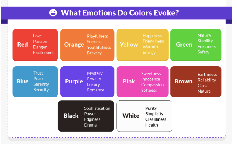
On top of that, it is believed that ads in color attract 42% more attention than similar advertisements in black and white. Finally, according to color psychology, particular colors evoke specific emotions and sentiments allowing consumers to connect to a brand on a deeper, more personal level. The colors you choose will also represent your brand, helping you get your values and identity across to consumers.
Colors also increase logo recognition.
- One in four consumers says that a color helps them remember a logo.
Red was chosen as the most memorable color. Next up are blue and green, while pink was identified as the least memorable color for a logo. (source: Study Finds, Research Gate)
To marketers, however, blue is the color of choice.
- Nearly 40% of Fortune 500 companies use blue in their logo designs.
Blue represents stability and security, features that most companies want their products to be associated with.
So, it’s not surprising that blue is used in the logos of almost 40% of Fortune 500 companies, including Facebook, Twitter, Dell, IBM, and AT&T.
Here is a breakdown of logo design by color:
- Blue – 198
- Black – 128
- Red – 83
- Green – 35
- Gray – 25
- Yellow – 7
- Orange – 7
- Multicolor – 6
- Purple – 6
- Brown – 3
- Metallic gold – 2
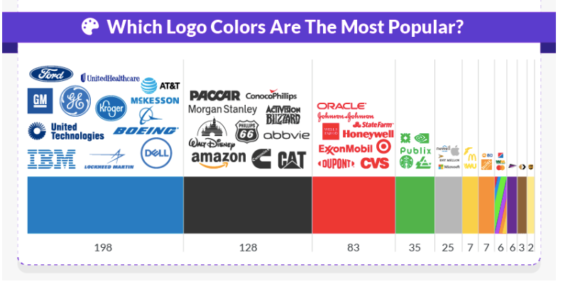
As you can see, very few companies opt for riskier colors like brown and purple. None of the companies use pink as this hue is mostly associated with specific items, such as toys or feminine products. Orange, which is typically used to cater to younger demographics, is also not used as much.
Gold may be the least popular, however, it doesn’t fail to make a statement. The two companies that have gold logos, Markel and MGM Resorts International, use this color to identify themselves as luxury brands. (source: Website Planet)
- 43% of Fortune 500 logos use two colors.
Two-color combination logos, like the ones of UPS and FedEx, are the most popular, used by 217 of the world’s biggest companies.
More stats show that:
- 37% of Fortune 500 companies use only one color, such as Coca-Cola and Johnson & Johnson.
- 14% use three colors, including Domino’s Pizza and Pepsi.
- 5% use four colors, such as Microsoft and Google.
- Less than 1%, such as NBC and Toys “R” US, have multi-colored logos.
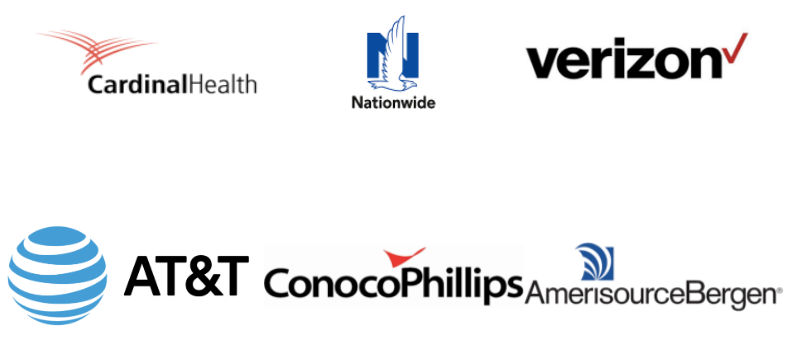
Among the logos that combine two colors, black and red is the most popular combo, used by 39 companies, such as Verizon and Cardinal Health.
Black and blue (used in 22 logos among the Fortune 500 companies, including AT&T and Nationwide) is also a common combination, while black and white (found in 21 logos, such as Chanel and Adidas) is the third most popular.
Just because these color combos are the most popular, doesn’t mean you have to follow that trend. You can go for some more unique color combinations and help your brand stand out from the competition.
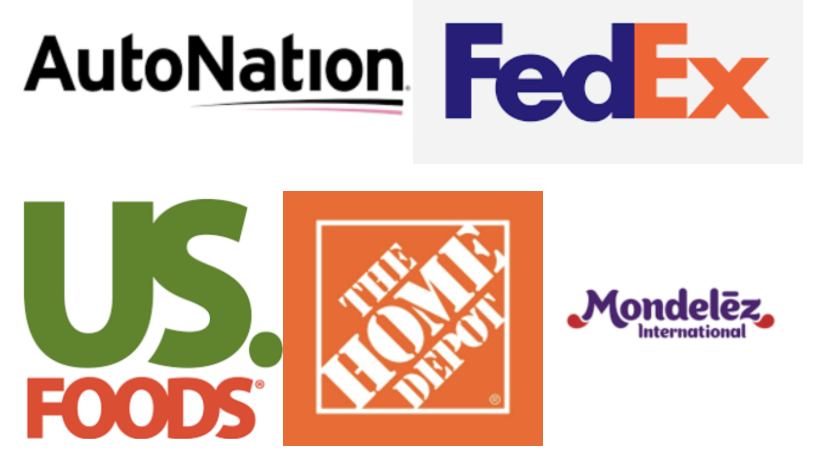
Here are a few unique color logo combinations:
- AutoNation’s black & pink logo
- FedEx’s classic purple and orange combo
- The green and red in the US Foods Holdings logo
- The Home Depot’s orange and white design
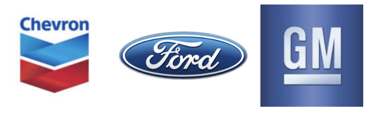
Gradients are one of the latest trends in logo design. Even though this development is not as widely accepted among Fortune 500 companies, there are 34 logo designs that have successfully implemented this element, including major brands like Chevron, Ford, General Motors, and UPS. (source: Website Planet)
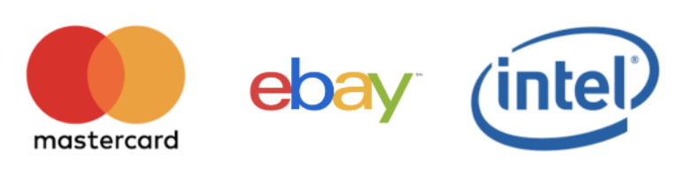
2. 61% of Fortune 500 companies have a combined logo.
More specifically, 307 of Fortune 500 logos are combination logos, including the logo marks of Walmart, MasterCard, and Dove. Combination logos are unbelievably versatile, letting companies use the image, the text or a combination of both, depending on the context. (source: Website Planet, Zippia)
The other types of logos found among Fortune 500 companies include:
- Wordmarks: 155, such as Disney, FedEx, Toys “R” Us
- Lettermarks: 24, including HP, GM, and H&M
- Emblems: 12, like Stella Artois, Ford, BMW
- Abstract icons: Only one—Nike
- Pictorial icons: Again only one—Apple

3. 73% of the 500 biggest companies in the world use Sans Serif fonts.
Even though color is one of the first things people see when they look at a logo, there are other elements that make up the design.
When it comes to font use, serif fonts are by far the most popular—only 11 logos use another font style, such as handwritten or script.
From the ones that incorporate serif fonts in their design:
- 73% use only sans serif, like Netflix and Facebook
- 18% use serif fonts, such as Rolex and Prada
- 6% use a combination of sans serif and serif fonts
Why are serif fonts so popular?
Historically, these are the easiest fonts to read. Even now, with new advances in screen resolution, the most successful companies in the world are still sticking to serif or sans serif fonts. (source: Website Planet)
4. A third of logos use title case capitalization in their designs.
You will see a lot of different capitalization styles among Fortune 500 companies, although almost half of them, including Costco and IBM, use all caps. 12% combine all caps and lowercase letters in their logos, whereas 7%, such as Intel and Mastercard, use lowercase.
Some companies avoid text altogether — 9% of global brands only use images in their logos, like Apple and Nike.
This is not a bad idea since studies show that the human brain is wired to process images 60,000 times faster than words. (source: Finances Online)
5. Round logos suggest friendliness, while asymmetrical designs evoke excitement.
International researchers have found that customers judge a brand based on the shape of its logo, too. For example, an angular logo will make customers see a pair of shoes as more durable, while a circular logo would lead them to see the same product as more comfortable.
Round logos suggest ‘softness’ in terms of the company’s friendliness, sensitivity, and warmth.
Symmetry is another deciding factor.
A study by the Carey Business School discovered that asymmetrical logos are perceived as more exciting.
Take a look at the Burger King logos. Both use a similar color palette, but the asymmetrical design appears much more vibrant and dramatic.
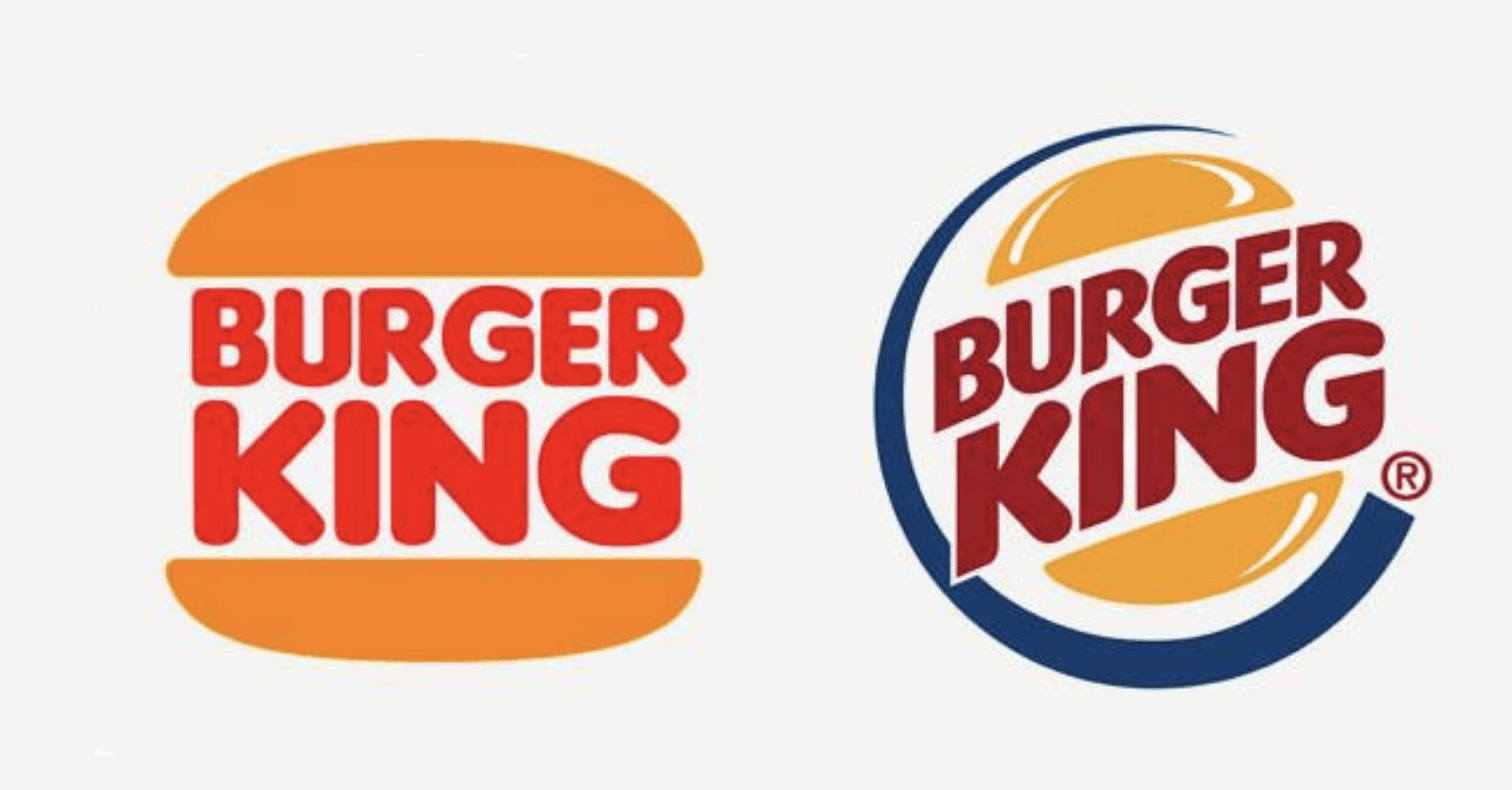
On the other hand, brands that want to be perceived as serious and formal might do better with a symmetrical logo. (source: Website Planet)
6. 60% of millennials expect a consistent brand experience from a company.
Over half of millennials expect a company to have consistent branding across all channels and they want to be able to access that information on multiple devices, as well as offline.
The good news is that a good logo design is versatile and can be used to brand almost anything. For example, over 50% of Americans own clothing with logos. 25% said they would wear a T-shirt with the McDonald’s sign, while a fifth said the same thing about Starbucks.
Last but not least, consistency in branding can increase sales by 23%.
To sum up: You need a logo that can be scaled to various devices and available for use across multiple channels. (source: Social Media Today, Study Finds)
What Is the Future of Logo Design
Now, let’s take a look at what the future holds for logo designs.
1. Technology will continue to drive change.
Creating a professional, up-to-date logo means keeping up with each new technological advance that comes our way.
An excellent example of how technology can affect logo design in US news channel CBS. The introduction of color TV in the 60ties led to CBS changing their black and white eye logo to a more colorful version.
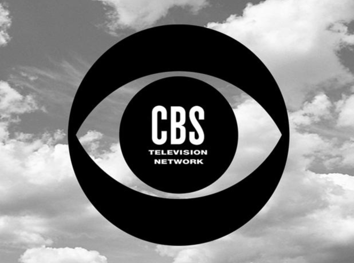 | 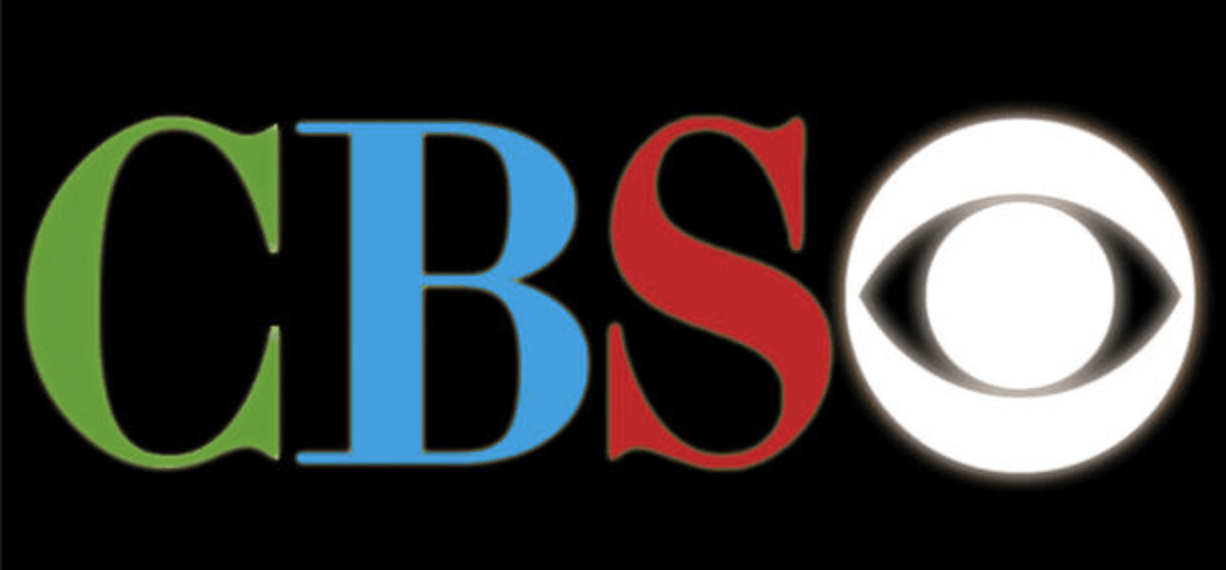 |
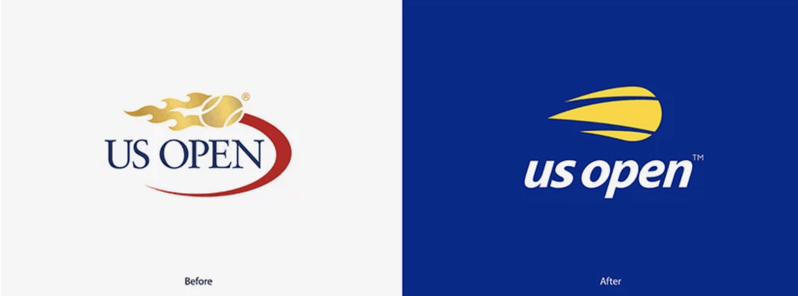
Mobile also made an impact on logos, pushing towards minimal, small-screen-friendly design. The US Open logo from 2019 clearly shows a shift towards mobile-oriented logo design.
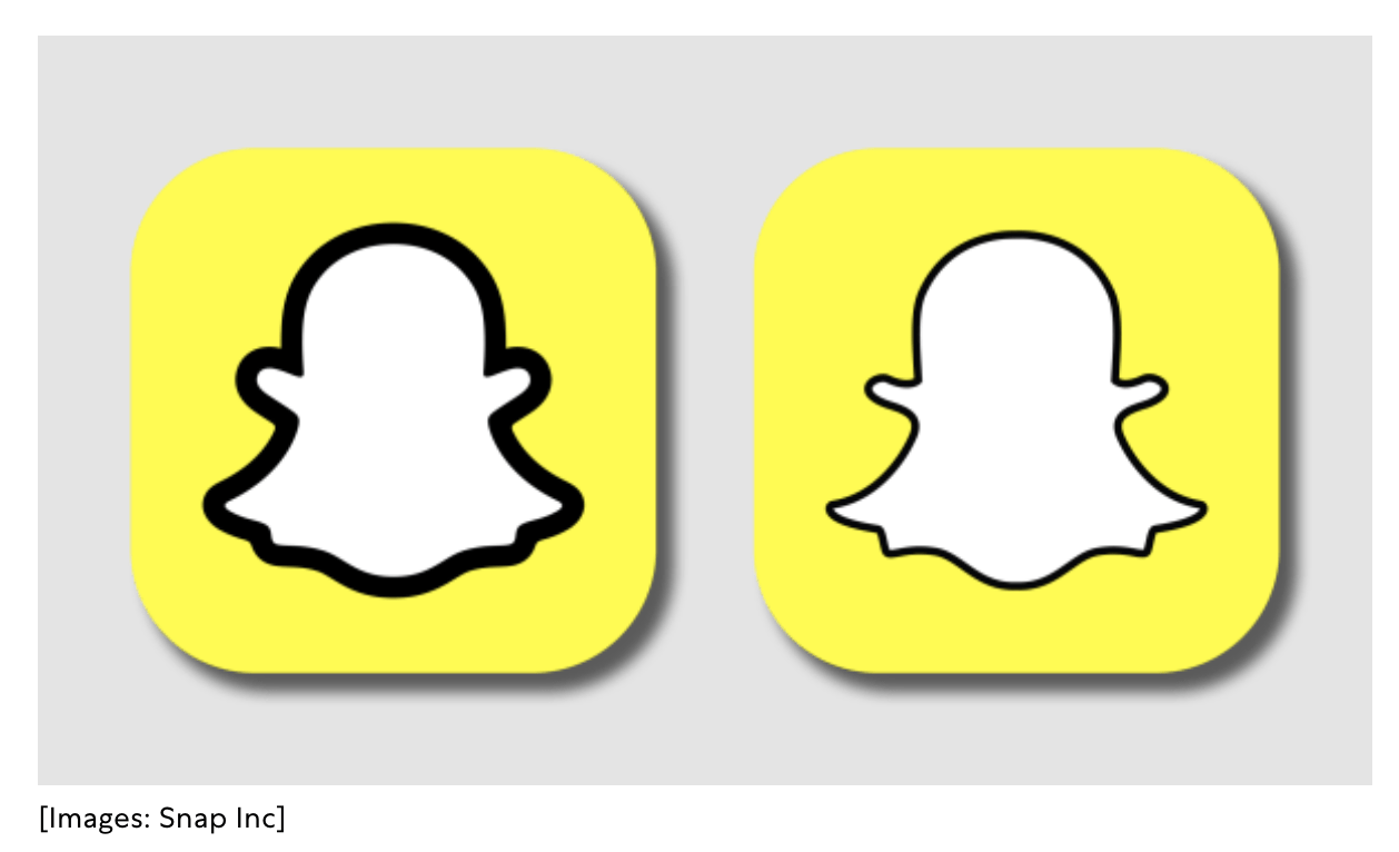
The introduction of apps led to Snapchat redesigning its famous logo. A simple bolded line provides more impact and much-needed contrast, especially for those tiny app badges.
2. Animation impacts logo design.
Animation has made interactive, engaging logos a real possibility. Today many companies like Google, Netflix, and Skype use animation to catch and hold the customer’s attention.
What’s more, animated logos can be incorporated into the overall user experience and promote the company’s dedication to technology and innovation.
It might surprise you to learn that animated logos are not a new trend. They’ve been in use ever since 1928, when MGM Studios pioneered the animated logo with their first real lion mascot, Jackie, roaring at the start of each movie.
3. The Rise of Dynamic Logos.
Dynamic logos, or designs that can be easily adapted to different contexts, devices, and ideas, are a similar concept.
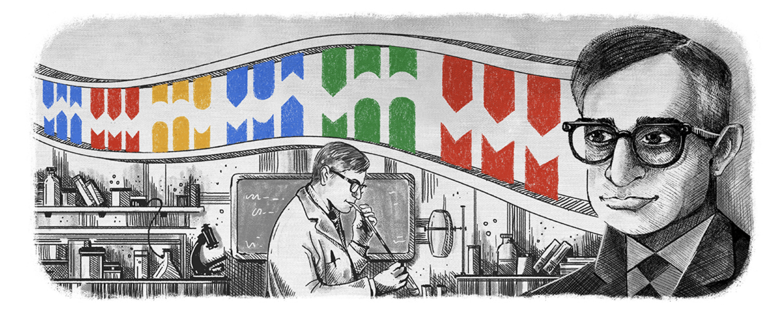
Perhaps Google Doodles are the best example of dynamic logos. Introduced in 1998, the first Google Doodle features a rough sketch of the famous Burning Man.

Since then, Google has altered its homepage many times, sometimes keeping the logo and at others eliminating text altogether, such as the one below celebrating the 96th birthday of Har Gobind Khorana, a pioneer in DNA research.
Why Do Companies Rebrand?
One of the most common reasons for rebranding is a merger.
A study by Landor Associates shows that 74% of S&P 100 companies have rebranded an asset they acquired within the first seven years.
Many businesses also rebrand to try to turn around a failing business. Others might want to introduce a new portfolio of products and services, expand the business to new countries or just give their image a boost.
Whatever the reason, rebranding your logo can breathe in some new life to your company, if done right.
If not, it can turn out to be a complete disaster.
Let’s take a closer look at some failure logo rebranding stories:
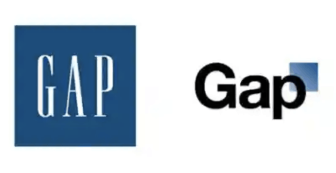
The Gap Logo Change Up
In 2010 Gap launched their new logo, a drastic change from the one they had for over 20 years. Customers hated it, and in just six days, the company returned to their old recognizable image.
It’s reported that this rebranding fiasco cost Gap around $100 million, which just goes to show brands should never underestimate the emotional bond customers have with logos.
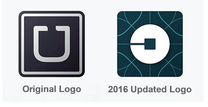
The Hated Uber Logo
The Uber logo has seen major overhauls throughout its history, but none had a bigger impact than the 2016 redesign.
Namely the company, eliminated the U and the name entirely and went for a more abstract design. Even though some argued that the 2016 logo was a good indication of the direction in which the company was moving, the majority disliked it and found it bizarre. Some have even called it ‘the most hated logo of the decade’.
The BP Logo Disaster
British Petroleum (BP) spent a whopping $211 million on their new logo in 2008, which tried to use eco-friendly colors and images to convince customers of the company’s green policies. Needless to say, customers were not impressed.
On the contrary, they found it cynical that an oil company would try and promote environmentally friendly ideas. The oil spill in the Gulf of Mexico did not help matters either.
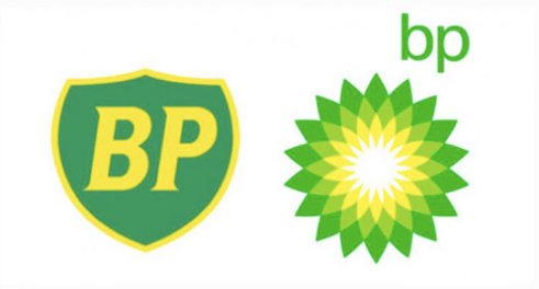
Unlike the Gap and Uber that ditched their rebranded logo, BP stuck with the new design and is still using it today. (source: Landor Associates, Klint Marketing, The Logo Creative, LogoMyWay, Landor Associates)
Some examples of successfully rebranded logos include:
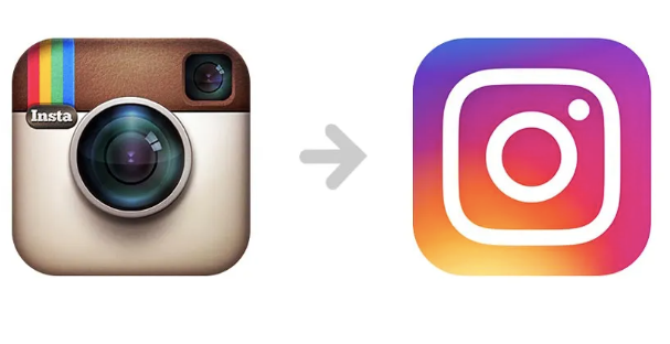
- Instagram which replced the old Polaroid camera logo for a new, sleek, and fun design.
- Starbucks, whose logo changed over time to show the company’s diversification into the market.

- FedEx, which wanted an eye-catching design and a fresh look, changed its logo many times in the past, resulting in a 20% increase in sales with the latest 1994 design.

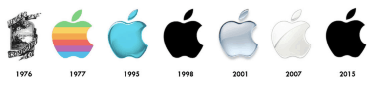
Still, one of the most successful rebranding stories belongs to Apple.
Apple changed its logo several times, gradually evolving into the sleek and stylish logo we all associate with the trillion-dollar tech company today. ((source: Inkbot Design, Website Planet)
Some brands, though, have stuck with the same logo for years.
For instance:
- Stella Artois’s logo, created in 1366, is the oldest design still in use today.
- Twinings Tea, using the same logo since 1887.

- Bass Ale, logo first used in 1876.
- Levi Strauss & Co., logo first created in 1886.
- The IBM logo, unchanged since 1972. (source: Time)
Some Fun Logo Facts and Stats
- Universal Studios, which was founded in 1914, has changed logos 12 times so far.
- FedEx’s logo design has won more than 40 awards. In fact, Rolling Stones magazine ranked it as one of the eight best in the last 35 years.
- Playboy earns most of its revenue from logo licensing. In 2017 alone, this amounted to $45 million.
Saul Bass is the most influential graphic designer of the 20th century.

Known for both the quantity and quality of logos he created, his designs include some of the most famous logos of all time, including Bell, Kleenex, and AT&T. (source: 99Designs)
Hidden Meanings in Famous Logos
- The logo of FedEx has a hidden arrow between the letter E and X to represent precision, speed, and progress.
- Wendy, a company that tries to evoke a cozy, home-cooked feeling, has the word “mom” written on Wendy’s collar.
- The letters BR in the Baskin-Robbins logo double as the number 31, i.e., the number of flavors the company offers.
- The yellow arrow under the Amazon logotype is a smile and an indicator that the company sells everything from A to Z.
- The space between the K and I in the Hershey’s Kisses logo is designed to look like a chocolate kiss. (source: CNBC, Design Hill, Inkbot Design, Finances Online)
Are You Ready to Create Your Logo?
Whether you go for an agency or you do it yourself, think long and hard about the image you want your brand to represent. As the logo statistics above clearly show, brands and logos go together, so you need to ask yourself: What lies at the core of your brand? What values are you trying to project? Who is your target audience?
Once you answer these questions, you can start to create the perfect logo for your company. Remember, keep it simple, both in shape and color palette, and always look for the most affordable alternative that will get you what you need without costing a fortune.