Today Google announced the roll out of its redesigned and so-called optimized Images page. Why I say so-called there are some valid points which you will come to know when you read the entire post. Though we always expect Google to deliver good features, but every good thing has a bad side. So this time it has come up with some major changes in its popular Images page. It can be said that it’s trying to copy it’s not so close competitor Bing, but Google remains ahead in its functionalities which Microsoft has failed to deliver in the past years after Google attained the number one spot in the Internet world.

So lets quickly have a glance of what new has been rolled out in the Google Images redesign & optimization process,
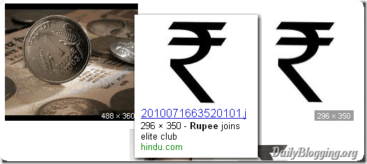
This feature has been quoted by Google as Dense Tiled Layout and to help searching users to find their images quickly, but if you are in a hurry then do switch back to the Basic Version of Google Images. I find this addition irritating as it displays too much images. Also, if an image like the one I queried for a Rupee Symbol image is a transparent one but saved as jpg then you don’t get the difference between two separate images as there is no border for an image which was present in the Previous Version. It also has an option on the sidebar to view the sizes in the main page itself.

This is the feature I liked the most. As we know recently Facebook unveiled the Hovercards features, Google has adapted it and rolled out the Hover Panes feature making it more easier for users to view the larger version of the thumbnail when hovered over it. It also has an option for Similar Images for certain images.

Google has gone one step further with it by showing approximately 40 Pages of Image searches which has about 1,000 Images. Earlier, this was easily achieved by using AutoPager addon in Firefox. This is a similar features on which Bing function, but the only difference being that Bing shows images as we scroll down very much similar to the AutoPager addon whereas Google stops at the 1,000th image and puts an option to Show more Results.
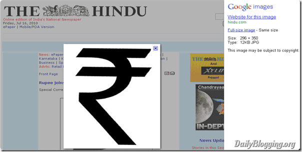
Instead of the vertical bar showing information about the image like the source, type and size now the same bar has been cleanly aligned on the right hand side vertically as a sidebar and the image is shown in the centre of the page below which, is the actual site that points to the image source.

Nothing advanced in terms of keyboard shortcuts in this. Just the basic Page up/down involved. Hope they soon come up with some keyboard shortcuts specially for the Images page.
Do you have something to say about the new roll out from Google ? Have your say using the comments section.